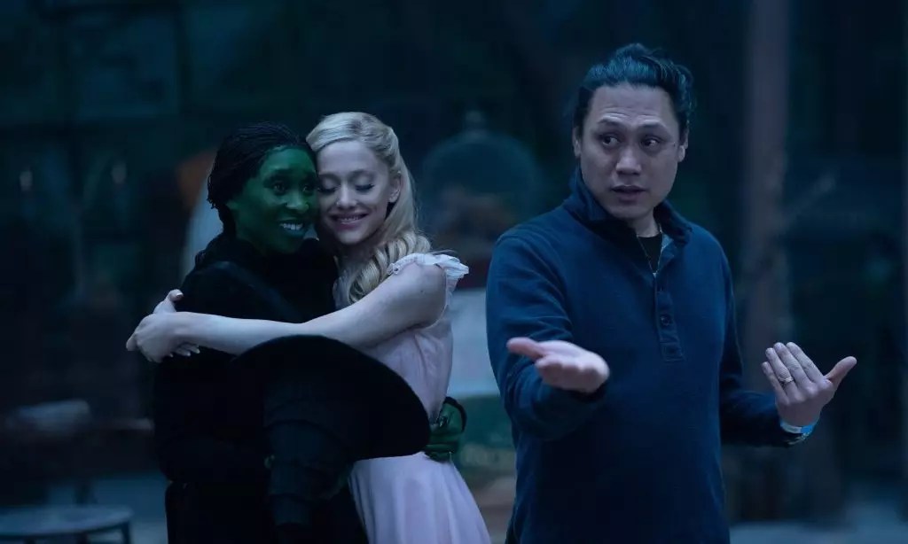
The discussion around the visual aesthetics of films often leads to polarized perspectives, and ‘Wicked,’ the highly anticipated adaptation of the beloved Broadway musical, is no exception. Director Jon M. Chu’s approach to color grading has stirred both praise and criticism, particularly from fans who hold the 1939 classic, ‘The Wizard of Oz,’ in high regard. This article delves deeper into the nuances of Chu’s vision, the impact of color grading on the storytelling, and the various interpretations by both audiences and critics.
Upon its release, ‘Wicked’ faced immediate comparisons to the vivid technicolor of ‘The Wizard of Oz.’ The latter’s vibrant hues and lush landscapes are iconic, setting a high bar for any subsequent interpretations of Oz. However, Chu’s reflection on the film’s stylistic choices underscored a purposeful departure from that traditional palette. He sought to present Oz not as a fantastical dreamscape but as a tangible, lived-in world. “I want to feel the dirt,” he articulated, emphasizing a desire for realism that transcends platitudes of sheer visual splendor.
Color grading is a crucial element in filmmaking, affecting not just the aesthetic but also the emotional undertones of the narrative. The choice to imbue ‘Wicked’ with a more desaturated palette was deliberate, aiming to evoke a sense of authenticity rather than mere fantasy. Chu’s perspective invites viewers to engage with this version of Oz on a more personal level, allowing them to witness the characters’ struggles and triumphs against a backdrop that feels grounded in reality.
The divergence in public opinion regarding the film’s coloring showcases the multifaceted relationship audiences have with visual storytelling. While some viewers expressed disappointment in the perceived lack of vibrancy, others defended the film’s aesthetic choices, suggesting that its earthy tones effectively complement the emotional arcs of the characters. The debate primarily catalyzed on social media platforms, where enthusiasts voiced their critiques or praises, often accompanied by comparisons and visual edits that enhanced brightness.
The dialogue surrounding ‘Wicked’s’ color grading reflects broader conversations about cinematic imagery and expectations. In an era where digital enhancements can easily mimic the richly saturated films of yesteryear, viewers are more discerning than ever about what they want to see on screen. Yet, Chu’s insistence on authenticity speaks to a yearning for narratives that resonate deeper than mere spectacle.
In his exploration of Oz, Chu also touched upon the technical limitations of recreating the classic technicolor aesthetic, noting that the technology itself has become increasingly obsolete. The advancements in visual effects offer the capability for grand visuals, yet they often come at a significant financial cost. As Chu mentioned, “Technicolor has largely been discontinued,” making the original method impractical—not only economically but also creatively.
The deeper message here is about evolving artistic sensibilities in the film industry. Chu emphasizes the significance of the landscape and how it interacts with the characters. The choice of earthy tones reflects both the characters’ struggles and their evolving relationship with the powerful and oppressive nature of the Wizard. This layered approach to color serves as a narrative device, enhancing the emotional stakes that Elphaba and Glinda must contend with throughout the story.
Despite—or perhaps because of—the discourse surrounding its visual portrayal, ‘Wicked’ has enjoyed exceptional commercial success. Breaking numerous box office records, it signifies a monumental moment for Chu, stars Ariana Grande and Cynthia Erivo, and the musical genre at large. The film’s impressive opening weekend marks a new benchmark in the pre-Thanksgiving release calendar, capturing audience hearts and sparking discussions that extend beyond mere aesthetics.
‘Wicked’ stands as a culmination of creative endeavor and audience engagement. Jon M. Chu’s vision resonates on multiple levels, highlighting the intersection of color, emotion, and storytelling. As discussions continue regarding its aesthetic choices, it remains evident that the film exceeds the limits of visual representation, inviting audiences to explore deeper themes of friendship, power, and self-discovery in the colorful yet grounded landscape of Oz.


Leave a Reply